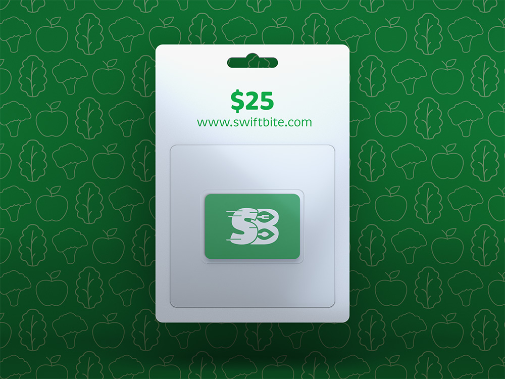
The purpose of this project was to design brand identity that included a logo that clearly communicates the brand’s core mission: efficient and organic food delivery. The logo features dynamic speed marks on the letter “S” to represent swift service, while the fork and spoon nestled within two leaves on the “B” signify the focus on organic cuisine.
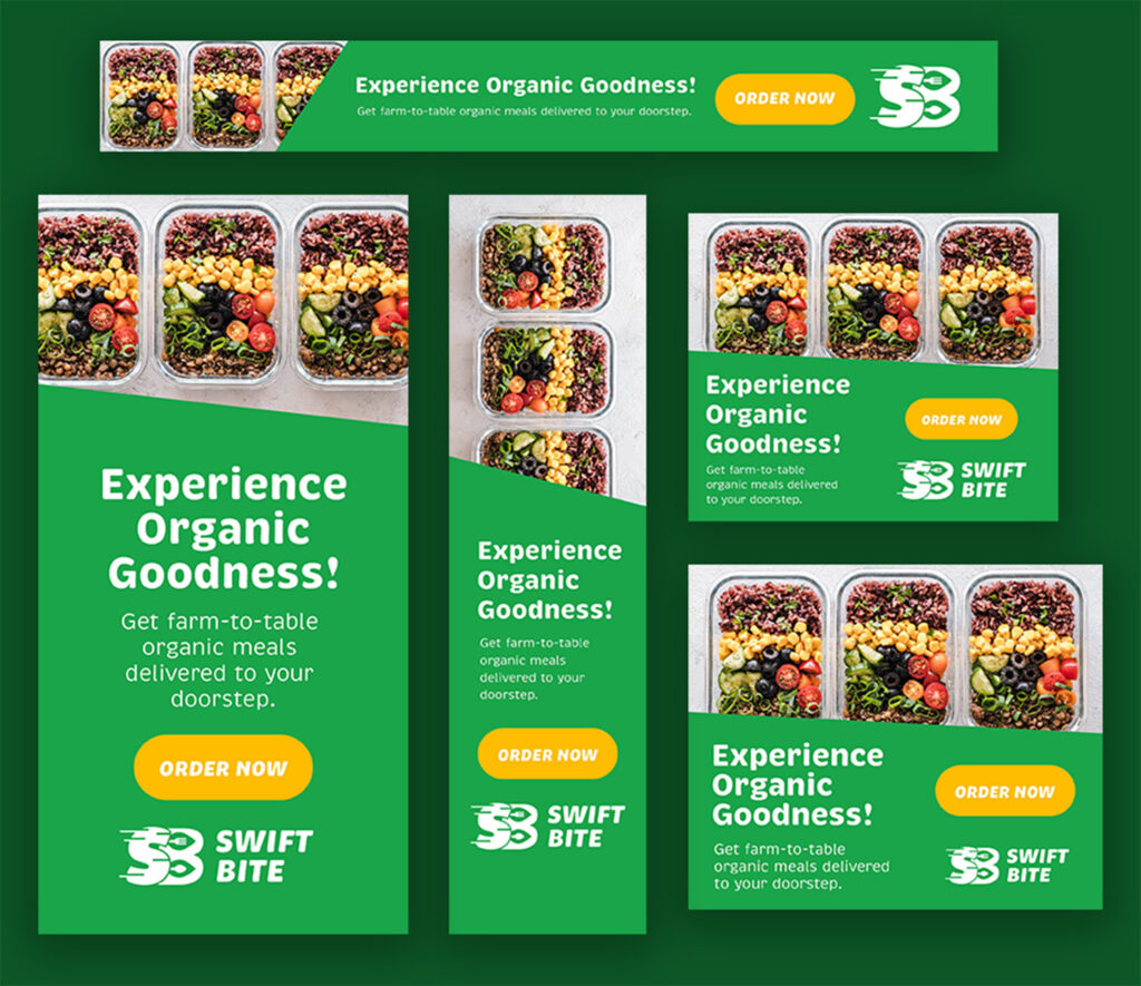
The use of bright green highlights the brand’s commitment to modernity and friendliness while reflecting its dedication to providing fresh, healthy food. This versatile logo is well-suited for various applications, including company delivery bags, hats, and merchandise, ensuring consistent branding across all touchpoints. Additionally, we developed banner ads to enhance the company’s promotional efforts and attract new customers.